Course Overview
This comprehensive CSS course takes you from fundamental styling concepts to advanced layout techniques. Designed as an eBook-style learning path, it provides both theoretical knowledge and practical skills to become a proficient CSS developer. Each chapter builds upon the previous one, ensuring a structured learning experience for creating beautiful, responsive websites.
- 10 In-Depth Chapters Covering CSS Fundamentals to Advanced Topics
- Practical Examples and Real-World Applications
- Hands-On Styling Exercises and Projects
- Final Assessment for Certification
Chapter 1: CSS Fundamentals
What is CSS?
CSS (Cascading Style Sheets) is a stylesheet language used to describe the presentation of documents written in HTML or XML. CSS controls how elements are rendered on screen, paper, or in other media, separating content from presentation.
Why Master CSS?
- Essential for creating visually appealing websites
- Critical skill for front-end developers and designers
- Enables creation of responsive designs that work across devices
- Reduces repetition through efficient styling techniques
Core Concepts Covered
- CSS syntax and structure
- Selectors and specificity
- The box model: content, padding, border, margin
- Basic styling: colors, fonts, text properties
Chapter 2: CSS Selectors and Specificity
Understanding Selectors
Selectors are patterns used to select the element(s) you want to style. Mastering selectors is crucial for applying styles precisely and efficiently.
Types of Selectors
- Basic selectors: element, class, ID, universal
- Combinator selectors: descendant, child, adjacent sibling, general sibling
- Attribute selectors: [attr], [attr=value], [attr~=value], etc.
- Pseudo-classes and pseudo-elements: :hover, :nth-child(), ::before, ::after
Specificity and Cascade
- How browsers determine which styles to apply
- Specificity hierarchy and calculation
- !important declaration and when to use it
- Inheritance and how it affects styling
Chapter 3: Layout Techniques
Traditional Layout Methods
Understanding different layout approaches helps you choose the right technique for each design challenge.
Layout Systems
- Normal flow: block and inline formatting contexts
- Floats: creating multi-column layouts
- Positioning: static, relative, absolute, fixed, sticky
- Display properties: block, inline, inline-block, none
Modern Layout Techniques
- Flexbox: one-dimensional layout system
- CSS Grid: two-dimensional layout system
- Multi-column layout for text content
- Comparison of when to use each technique
Chapter 4: Responsive Web Design
Principles of Responsive Design
Responsive design ensures websites work well on a variety of devices and window or screen sizes.
Core Responsive Techniques
- Viewport meta tag and its importance
- Media queries: syntax and practical applications
- Breakpoints: how to choose and implement them
- Mobile-first vs. desktop-first approaches
Responsive Units and Values
- Relative units: %, em, rem, vw, vh, vmin, vmax
- When to use relative vs. absolute units
- Flexible images and media: max-width, object-fit
- CSS functions: min(), max(), clamp() for fluid typography
Chapter 5: Flexbox Deep Dive
Understanding Flexbox
Flexbox is a one-dimensional layout method for arranging items in rows or columns, offering efficient space distribution and alignment capabilities.
Flex Container Properties
- display: flex and display: inline-flex
- flex-direction: row, row-reverse, column, column-reverse
- flex-wrap: nowrap, wrap, wrap-reverse
- justify-content: alignment along the main axis
- align-items and align-content: cross-axis alignment
Flex Item Properties
- order: controlling visual order independent of source
- flex-grow, flex-shrink, and flex-basis
- align-self: overriding container alignment for individual items
- Practical flexbox patterns and use cases
Chapter 6: CSS Grid Mastery
Grid Layout Fundamentals
CSS Grid is a powerful two-dimensional layout system that revolutionized web layout capabilities.
Grid Container Properties
- display: grid and display: inline-grid
- grid-template-columns and grid-template-rows
- grid-template-areas for named grid areas
- gap (grid-gap): controlling space between grid items
- justify-items, align-items, justify-content, align-content
Grid Item Properties
- grid-column and grid-row: positioning items
- grid-area: placing items in named areas
- justify-self and align-self: individual alignment
- Implicit vs. explicit grid tracks
Chapter 7: Transforms, Transitions and Animations
CSS Transforms
Transforms allow you to modify the coordinate space of elements, enabling rotation, scaling, skewing, and translation.
Transform Properties
- transform: translate(), rotate(), scale(), skew()
- 3D transforms: perspective, rotateX/Y/Z, translateZ
- transform-origin: changing the origin point of transformations
- Performance considerations for transforms
Transitions and Animations
- CSS transitions: property, duration, timing-function, delay
- CSS animations: @keyframes, animation-name, duration, etc.
- Transitioning transform properties for smooth effects
- Animation performance best practices
Chapter 8: Advanced CSS Features
CSS Variables (Custom Properties)
CSS variables allow you to store specific values to reuse throughout a document, making stylesheets more maintainable.
Working with Variables
- Declaring and using custom properties (--var-name: value)
- Scope: global vs. local variables
- Fallback values with var() function
- Using CSS variables with JavaScript for dynamic theming
Other Advanced Features
- CSS filters: blur, brightness, contrast, drop-shadow, etc.
- Blend modes: background-blend-mode and mix-blend-mode
- Clip-path: creating custom shapes
- Masking: showing parts of elements while hiding others
Chapter 9: CSS Architecture and Methodologies
Writing Maintainable CSS
As projects grow, CSS can become difficult to maintain without proper architecture and organization.
CSS Methodologies
- BEM (Block, Element, Modifier) naming convention
- OOCSS (Object-Oriented CSS) principles
- SMACSS (Scalable and Modular Architecture for CSS)
- ITCSS (Inverted Triangle CSS) for organized codebase
Preprocessors and Postprocessors
- SASS/SCSS: variables, nesting, mixins, functions
- LESS: similar features with different syntax
- PostCSS: transforming CSS with JavaScript plugins
- CSS-in-JS: styled-components, emotion, etc.
Chapter 10: Performance, Accessibility and Cross-Browser Compatibility
CSS Performance Optimization
Efficient CSS contributes to faster loading websites and better user experiences.
Optimization Techniques
- Reducing CSS file size: minification, compression
- Efficient selectors and rendering performance
- Critical CSS: extracting above-the-fold styles
- Reducing repaints and reflows for better performance
Accessibility and Compatibility
- Writing accessible CSS: focus styles, reduced motion
- Cross-browser compatibility strategies
- Feature queries with @supports for progressive enhancement
- Vendor prefixes and when to use them
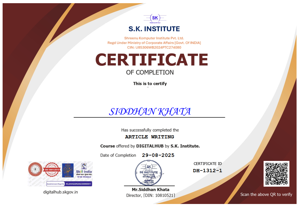
Certification & Assessment
After completing all chapters, you will need to pass a final assessment that includes both theoretical questions and practical styling challenges. Scoring 50% or higher is required to receive your Master in CSS certificate.